Chapter 7 Making data work together: joins
Summary
This chapter introduces joins, which are techniques for combining two or more datasets together. These represent the last of the fundamental elements of data analysis.
R tibble functions
inner_joinleft_joinandright_joinselectnestunnest
SQL functions
GROUP BY,SELECT ... FROM,WHERE,SUM,COUNT(*),NATURAL JOIN,ORDER BY,HAVING
ggplot functions
reorder
We’ll also look at nested data, which is a slightly more advanced data structure related to joins. You will definitely need to use joins yourself to do any real data analysis. Nesting is not so indispensable, but it is central to two of the forms of data that we’re looking at next, map and texts.
7.1 Merging Data
In the humanities, you will almost always need to provide some new data; and often you will want to make that data work together with something else. Unexpected juxtapositions and comparisons are one of the most useful ways to quickly bring your knowledge of a particular area into data analysis.
7.1.1 Selects and filters
Once or twice before, I have snuck a piece of code into a chapter that uses the function select on a dataframe. select works to thin out the number of columns in a dataset; so for instance, crews %>% select(feet, date){r} would filter data down to have just two columns, ‘feet’ and ‘date.’
select is a useful function, but it is far more dispensable than filter, which reduces the number of row rather than columns.
That has to do, simply, with the shape of data. With tidy data,
each row is an observation; so filtering changes the nature of the
dataset that we’re looking at. The columns define what questions we can ask; but because of that, getting rid of some of them doesn’t change
the questions we can ask.
7.1.2 Combining data horizontally and vertically.
When we get to the task of extending a dataset, something very similar applies; but now it is the columnar function that is all-important. The operation for adding new columns to a dataset based on the existing rows is called a “join,” and it is the final fundamental element of the basic vocabulary of data analysis. There are, in fact, several different types of joins that we’ll look at in turn.
(There is also an row-wise analogy to the ‘join’ called bind_rows. It can be useful, especially, when you are rejoining the results of some analysis; it simply combines any number of dataframes rowwise, matching column names where they are present.)
To think about how to work with these, consider the book summaries we’ve explored a bit already. We have some evidence in “subjects” about what they’re about, but most Library of Congress books also have a single shelf location that nicely categorizes them. Here’s an example of what those look like. This has a number of different columns: the code you’ve already seen, a description of the subject for the code, and a more general column that I’ve defined somewhat capriciously to capture distinctions like “sciences” as opposed to “humanities.”
LC_Classification %>%
  filter(lcc %in% c("DA", "ML", "E", "QA")) %>%
  select(lcc, NarrowSubject)
How can we use these classes on our data? A join works by matching the columns between two dataframes.
First, we need a tibble that gives the lc code for each book in our collection. I’ve provided once of these at book_lcc_lookups; but you could also create one from–for instance–the HathiTrust online lookup.
book_lcc_lookups %>% head(4)The simplest join is the inner_join. By default, it looks for columns with the same name in two different datasets. For each one, it seeks out rows where the first (which we call the ‘left,’ in reading order) dataset and the second (‘right’) dataset share the same value. (For instance, they both have ‘lcc’ equal to “AB.”)
If we try to plot, this, though, we see a problem; although we have a plot of the most common classifications, they are completely inscrutable.
Note also that there is a new plotting function in the mix here: coord_flip. This is a useful combination in ggplot when you want to create readable bar charts. The reason is that you must have the y-axis be quantity when using geom_col or geom_bar; but text is generally more readable in a horizontal orientation.
joined = books %>%
  inner_join(book_lcc_lookups) %>%
  count(lcc)
## Joining, by = "lccn"joined %>%
filter(n > 1000) %>%
ggplot() +
geom_col() +
aes(y = n, x = lcc) +
scale_y_continuous() +
coord_flip()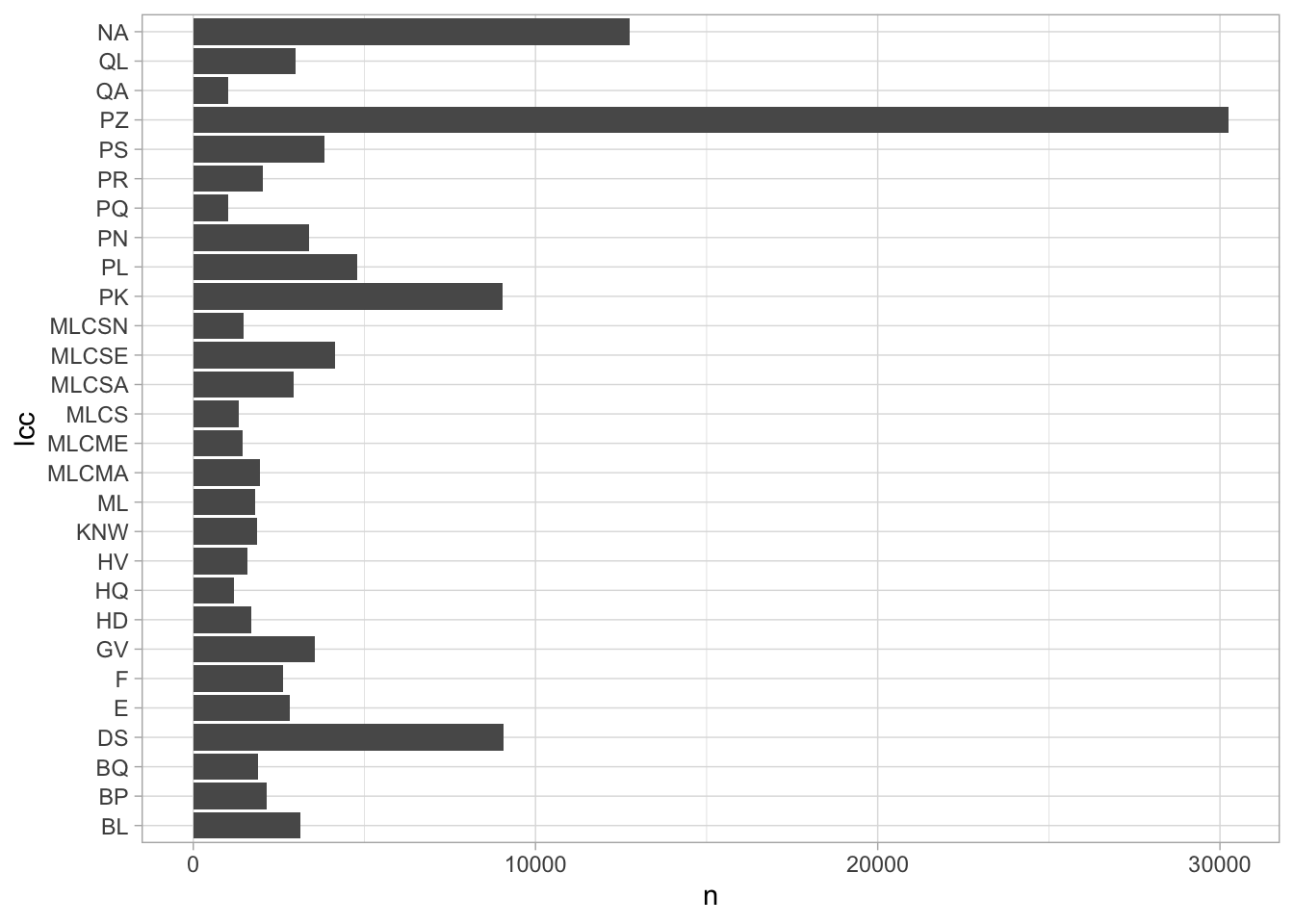
The solution to this is another join, this time against our LC_Classification frame.
joined_with_labels = joined %>%
  inner_join(LC_Classification)
## Joining, by = "lcc"#LC_Classification %>% anti_join(book_lcc_lookups)
science = LC_Classification %>% filter(BenSubject == "Science") %>% select(lcc)Again, we some ggplot-related tricks. To make the bars appear in descending order, we use to reorder to make the variable that we’re plotting (here, the shelf code) be sorted by frequency (the variable n.)
And to make the classification labels display on multiple lines, we use str_wrap.
joined_with_labels %>%
filter(n > 1000) %>%
ggplot() +
geom_col() +
aes(y = n,
x = reorder(classification %>% str_wrap(30), n),
fill=BenSubject) +
theme(legend.position = "bottom") +
coord_flip()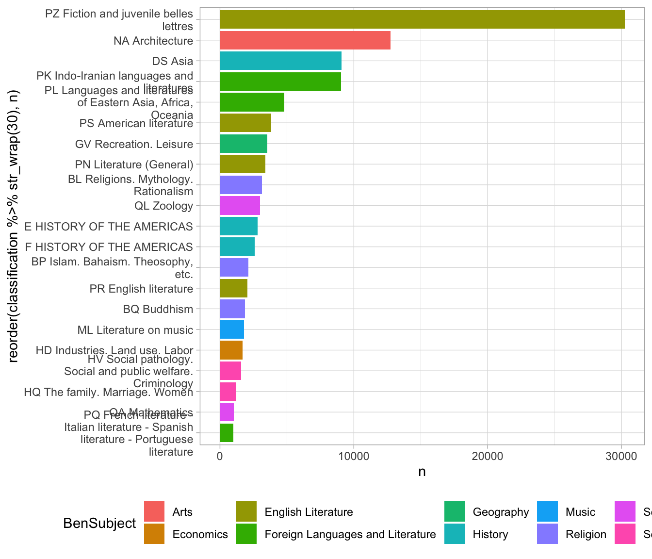 In this case, it starts to tell us something about the books that
have summaries in the library of Congress catalog; specifically, that
they show a strong slant towards subject areas having to do with South Asia. (Indo Iranian languages; Buddhism; Asian history; and Islam are all heavily represented.)
In this case, it starts to tell us something about the books that
have summaries in the library of Congress catalog; specifically, that
they show a strong slant towards subject areas having to do with South Asia. (Indo Iranian languages; Buddhism; Asian history; and Islam are all heavily represented.)
7.2 Renaming and joins
Often joins will be just that simple. But suppose that we wanted to look
not at the fine-grained distinction, but at the general classes. We can create a new field called lc1 that captures only the first letter of the
LC classification using the str_sub function. This then uses a ‘by’ argument to inner_join to tell it exactly which column names to match.
The one on the left is lc1 because that’s the title in the first join argument, and on the right is “lcc” because that’s the second table being joined.
(We could also simply have had the mutate function rewrite the lcc column to have only a single character; then the inner_join would find a column named lcc in each and happily merge away without us having to tell it the column names. In a flurry of data analysis, that is probably what I’d do; but it’s better in code to be a little more clear if possible about what the variables actually are.)
joined %>%
  mutate(lc1 = lcc %>% str_sub(1, 1)) %>%
  group_by(lc1) %>%
  summarize(n=sum(n)) %>%
  inner_join(LC_Classification, by = c("lc1" = "lcc")) %>%
  ############################### ^^^^^^ here ^^^^^^^ ######
  ggplot() +
  aes(x=reorder(classification, n), y = n, fill=BenSubject) +
  geom_col() + coord_flip() +
  theme(legend.position = "bottom")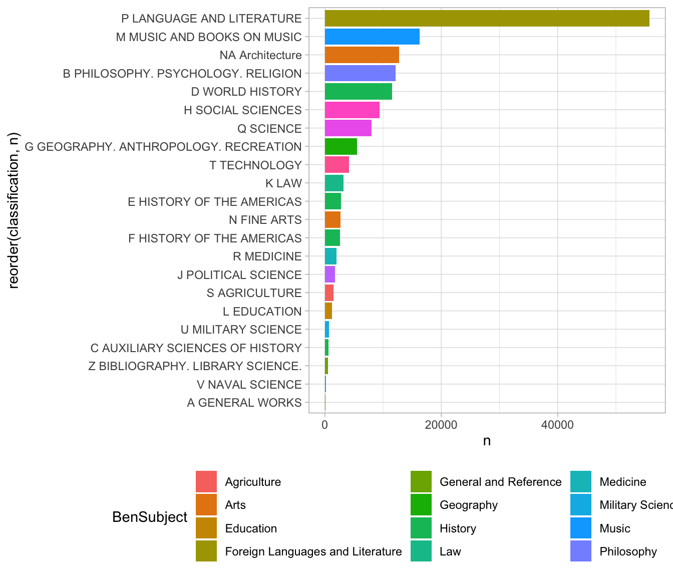
When working with joins, your data can easily get much larger–perhaps big enough to overload your laptop. One of the principles of joins is that you should, generally, wait until after your summarize operations to do them.
7.2.1 Left joins and anti-joins
All of this work presumes that each step in our data pipeline does not lose any data. But in fact, it did! If we use nrow, we can see that there were 324 rows before the join, and just 210 afterwards. We’ve lost a third of our data.
joined %>% left_join(LC_Classification) %>% nrow## [1] 324Often this behavior is desired–it gets rid of bad data. But sometimes you want to keep the unmatched items.
Different types of joins differ principally in the way that they handle these cases of missing data.8
9: I say “principally” because some types of joins, such as the semi_join, have slightly different behavior. You can read the inner_join documentation for a fuller explanation. Not every data manipulation environment supports the semi join, however.
Here is a summary of the four most important types of join.
| Join type | Behavior |
|---|---|
inner_join |
Keeps rows where the shared column labels exist in both left and right inputs. |
left_join |
Keeps all rows from the left input, even if there aren’t matches on the right input. |
right_join |
Keeps all rows from the right input, even if there aren’t matches on the left input. |
anti_join |
Keeps all left input where there are not matches on the right. |
In this case, it’s useful to do an anti_join as part of data exploration to see what information we’re losing.
Here we can see that most common missing codes start with “MLC”; this is a placeholder used at the Library of Congress that stands for “Minimal Level Cataloging” when a true shelfmark hasn’t been assigned. When uniting data from different sources, it is quite common to lose data in ways like this; you must be careful to be aware of what’s getting lost.
joined %>% anti_join(LC_Classification) %>% arrange(-n) %>% head(4)## Joining, by = "lcc"7.2.2 Abstract data, SQL databases, and normalization.
Data joins can serve two purposes. One–which we’ve explored here–is to allow you to extend out your dataset in new directions by finding new information about some element. This is about extrinsic data joining.
Another has to do with the complicated intrinsic structure of many datasets. Databases are rarely a single table of the time we’ve been exploring here; instead, they consist of a set of tables with
defined relationships.
In the history of databases, especially before the Internet, joins were important largely for making it possible to capture the structure of datasets with a minimal amount of duplication. A classical example in the database literature involves business transactions.
A mid-size paper company tracking its orders would not want to keep full information about each customer and type of paper for every transaction.
It would instead keep one table of its possible inventory (with prices, size, colors, etc.) and another of every customer it has; the master table of orders would simply contain a date, a field called customer_id, and another called item_id. Such structures are called more highly ‘normalized;’ there is an extensive taxonomy of the many different levels of normalization possible for data. (See the Wikipedia Article for a short introduction.)
The language that we use in R borrows extremely heavily from this 1970s-era work to define data structures. It borrows, in particular, from the language SQL (short for “structured query language,” but often pronounced “sequel”) that formed the basis of much database design in the last quarter of the 20th century.
It is worth exploring these relationships a bit more closely, because they capture the ways that the tidyverse provides a general formal language for data manipulation, not just an arbitrary set of functions. The general ideas of SQL–grouping, summarizing, filtering, and joining–remain entirely intact in R, as well as in other modern data analysis platforms like pandas, the most widely used python platform for data science.
7.2.3 Tidyverse to SQL equivalencies.
| dplyr | SQL |
|---|---|
| select | SELECT … FROM |
| n() | COUNT(*) |
| group_by | GROUP BY |
| filter | WHERE |
| summarize | (happens implicitly after GROUP BY) |
| mean | MEAN |
| sum | SUM |
inner_join without any (by) argument |
NATURAL JOIN |
inner_join with (by) argument |
INNER JOIN |
left_join |
LEFT JOIN |
right_join |
RIGHT JOIN |
outer_join |
OUTER JOIN |
head(10) |
LIMIT 10 |
slice(5, 15) |
LIMIT 5,15 (but it does not operate within each group.) |
(Further references: SPARQL, a query language for building out indefinitely complicated queries. SPARQL–and the linked open data movement–is one of those things that’s a good idea in theory but that, in practice, has not been as widely used as its creators hoped.)
7.3 Self joins
In general, joins happen between two different tables. But an important strategy for certain types of data is the self join. Self joins are not a different type of join function, but rather a way of thinking through connections inside a single dataset.
In a self join, both the left- and the right-hand table are versions of the same dataset. In the complete form, this is not useful at all!
7.4 The Pleiades dataset: Real-world modeling and SQL querying
But in real world humanities data, the complexities of data modeling often revolve around how to define relationships between different sets. So rather than explore one of the relational sources that exists, we’ll look at something slightly stranger; the “Pleiades” database of places in the ancient world.
At heart, Pleiades is a geographical database. But the geography of the ancient world is sometimes fuzzy, uncertain, or even mythical; and the relationship between entities can be difficult to firmly explore.
The Pleaides project has come up with an interesting solution to this. They distinguish between places, names, and locations. As they put it, “Places are entirely abstract, conceptual entities. They are objects of thought, speech, or writing, not tangible, mappable points on the earth’s surface. They have no spatial or temporal attributes of their own.”10
11: “Conceptual Overview,” https://pleiades.stoa.org/help/conceptual-overview. Sean Gillies, Jeffrey Becker, Elizabeth Robinson, Adam Rabinowitz, Tom Elliott, Noah Kaye, Brian Turner, Stuart Dunn, Sarah Bond, Ryan Horne.
Some places might not have a known location (Atlantis, the Garden of Eden); and some places do not have a name (a midden discovered in a potter’s field in the 1950s.) Names can exist separated in language or in time. As one figure from the Pleiades set–which may mask as much as it shows–indicates, there are a variety of different possibilities for connection or lack of it.
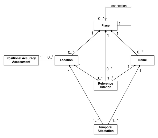
Data Description of the Pleiades dataset.
Tom Elliott, “The Pleiades Data Model,” April 09 2017. https://pleiades.stoa.org/help/pleiades-data-model
This is bundled in the latest version of the HumanitiesDataAnalysis package. (You may need to run update_HDA() and restart to get it.)
The HumanitiesDataAnalysis package includes a copy of the Pleiades set as a database which includes three of these tables; locations, names, and places. A function called pleiades_db will return a database “connection” which you can use to explore it.
A connection does not load the contents into memory; instead, it provides something that you can explore. Here,
Rather than interact with these files by loading in a CSV, we can query the database files directly. This involves setting up a database “connection.”
pleiades = pleiades_db()There are a few ways that we can interact with this. The first is to pull out individual tables using dplyr’s tbl function. Although these files are located on disk, we can interact with them using the same dplyr functions we’re used to in most cases.
pleiades %>% tbl("names") %>%
  select(title, nameTransliterated, pid) %>%
mutate() head(5)## [1] 5We can drop these straight into plotting pipelines. Here, for example, are the latitude and longitude of the point database; you can clearly see the outlines of the Mediterranean sea nad the Nile river to the left, and some of India to the right.
I have used another trick here, which is to pass alpha as a parameter to the graphing function; it is a special term that represents transparency on a scale from zero to one. Alpha of 1 is fully opaque, and alpha of 0 is invisible; the value I’ve used here, 0.05, means that a point will only look black if 20 points are plotted over it. Like most graphical elements in ggplot, alpha can be set as an aesthetic or hard coded for an entire layer.
pleiades %>% tbl("locations") %>% select(reprLat, reprLong) %>%
  ggplot() +
  geom_point(size = 0.01, alpha = 0.05) +
  aes(x=reprLong, y=reprLat)
## Warning: Removed 7323 rows containing missing values (geom_point).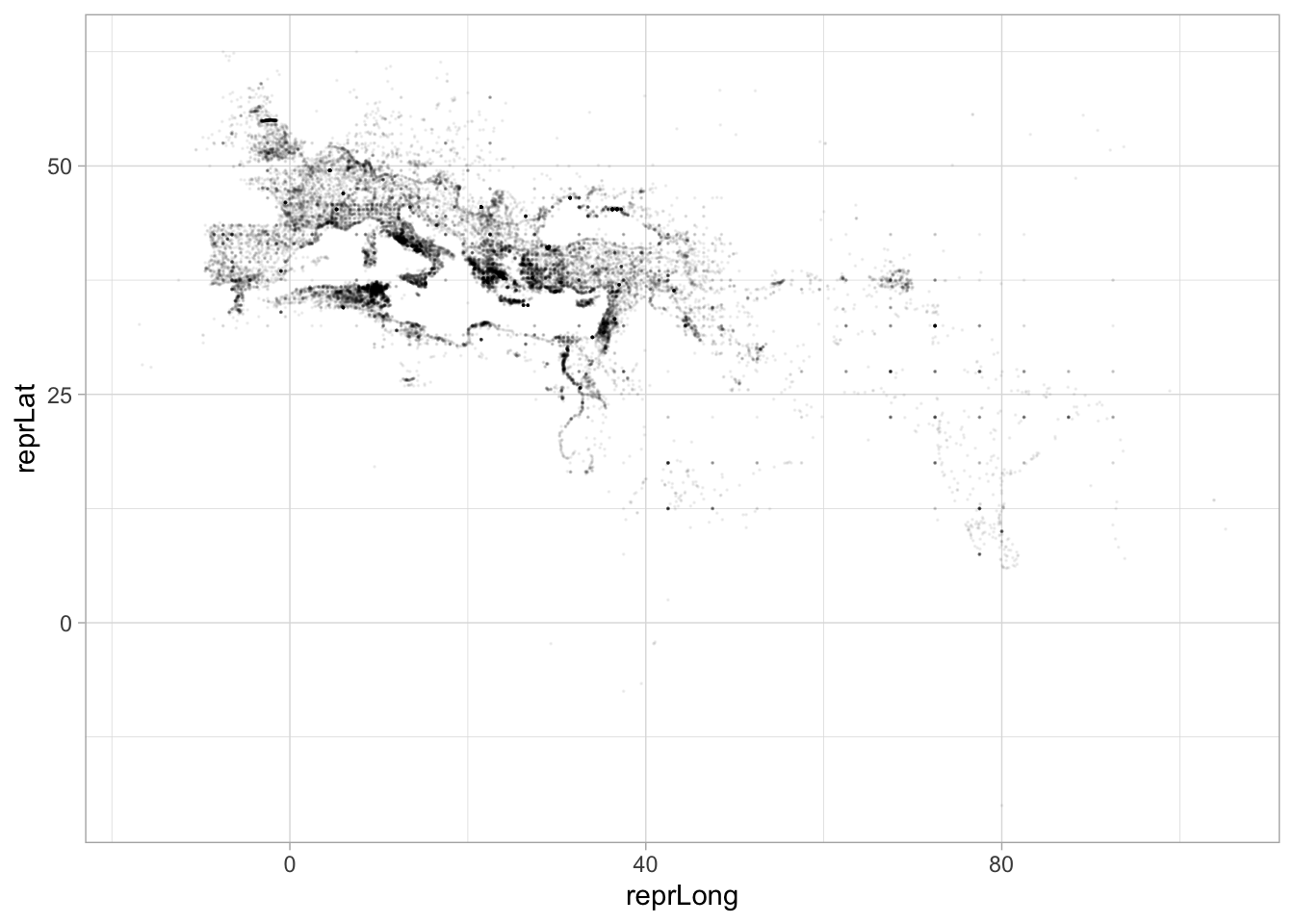
7.4.1 Writing SQL queries.
We can also write SQL queries directly. Compare the code below to the dplyr code that we’ve been writing. Almost all of the terms should be familiar–the only differences are the usage of COUNT(*) instead of n() to capture the number of rows and the use of ORDER BY N DESC instead of arrange(-n).
The following query looks for the places with the highest number of names associated with them in the pleiades set.
SELECT title, COUNT(*) AS N
FROM names GROUP BY pid
ORDER BY N DESC
LIMIT 8| title | N |
|---|---|
| Samarra | 104 |
| Diospolis Magna | 39 |
| Sykamina | 34 |
| Ashqelon | 30 |
| Arbela | 29 |
| Krokodeilon polis | 28 |
| Ioppe | 28 |
| Ierusalem | 28 |
Note also some of the differences. In SQL, we describe data analysis not as a flow but as a single, declarative step. This is one of the fundamental distinctions among programming languages; SQL is what is known as a “declarative” language because you simply describe what you want–here, a particular set of results–
pleiades %>% tbl("locations") %>% collect %>% group_by(pid) %>%
  mutate(count=n()) %>%
  arrange(-count) %>%
  slice(1:2) %>%
  ungroup %>%
  arrange(-count) %>%
  select(title, pid, count) %>%
  head(10)
7.5 Nests and deeply structured data
There is a final dplyr operation that departs a bit from standard SQL practices, which is to allow nested data.
As a first example, let’s consider some of the data separated by commas in the Pleiades tables.
names = pleiades %>% tbl("names") %>% collect

names %>%
  mutate(modified = parse_datetime(modified)) %>%
  mutate(created = parse_datetime(created)) %>%
  select(creators, authors, created, modified) %>%
  mutate(author = str_split(creators, ",")) %>%
  unnest(author) %>% select(author, created, modified) %>%
  group_by(author) %>% filter(n() > 500) %>%
  ggplot() + geom_point(position='jitter', alpha = 0.1) +
  aes(y=created, color=author, x = author) + coord_flip()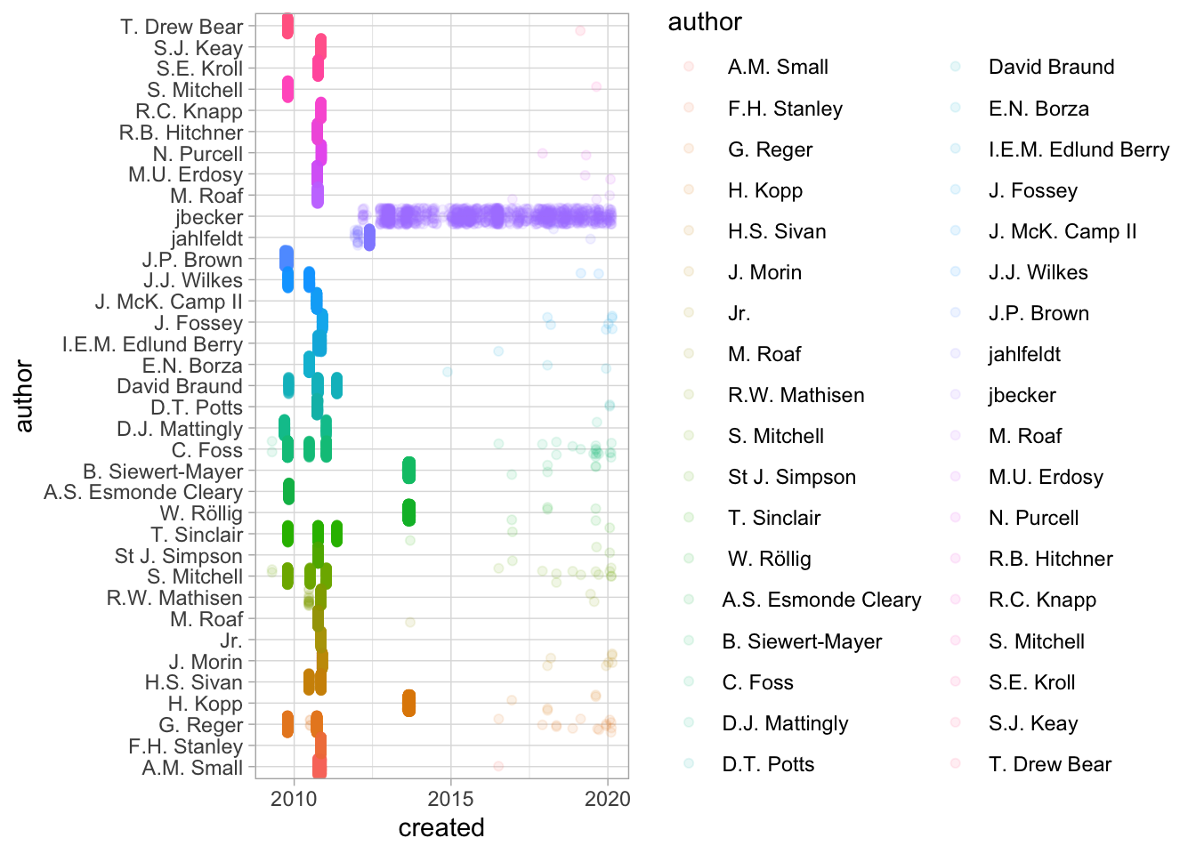
7.6 Exercises: joins and nesting.
The following code in SQL does a simple select.
SELECT title, COUNT(*) AS N
FROM names GROUP BY pid
ORDER BY N DESC
LIMIT 8;
Rewrite it in R. The code below takes part of preparing the table itself for work, which corresponds to “FROM names” above; the rest, you’ll have to do yourself and put into a sensible order.
pleiades = pleiades_db()

pleiades_db() %>%
  tbl("names") %>%
  KEEP_GOING
We can use joins and nests to make datasets much larger. We’ve looked a bit before at the “subjects” field in our books dataset. Now we’ll split it up using an unnest operation.
all_subjects = books %>%
  mutate(subject = str_split(subjects, " -- |///")) %>%
  select(lccn, subject)

all_subjects %>% head(3)
all_subjects %>% head(10) %>% unnest(subject)- There are
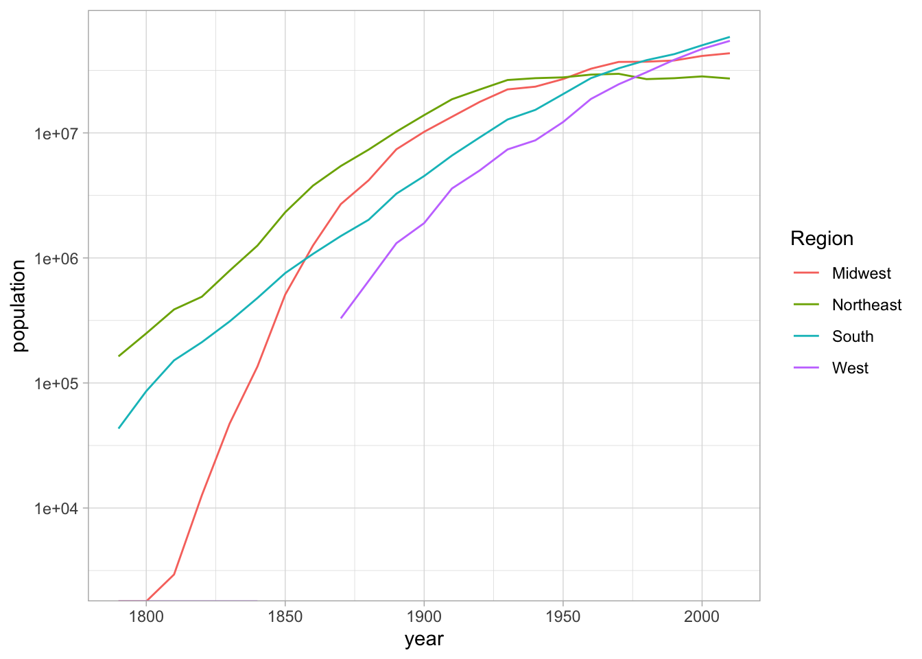
long_cities = CESTA %>%
  pivot_longer(`1790`:`2010`, names_to = "year", values_to = "population")

divisions = read_csv("https://raw.githubusercontent.com/cphalpert/census-regions/master/us%20census%20bureau%20regions%20and%20divisions.csv")
##
## ── Column specification ────────────────────────────────────────────────────────────────────────────────────────────────────────────────────────────────────────────────────────────────────────────────────────────────────────────
## cols(
## State = col_character(),
## `State Code` = col_character(),
## Region = col_character(),
## Division = col_character()
## )long_cities %>%
mutate(year = as.numeric(year)) %>%
inner_join(divisions, by = c("ST" = "State Code")) %>%
group_by(Region, year) %>%
summarize(population = sum(population)) %>%
ggplot() +
geom_line(aes(x=year, y = population, color=Region)) + scale_y_log10()## `summarise()` has grouped output by 'Region'. You can override using the `.groups` argument.## Warning: Transformation introduced infinite values in continuous y-axis