Just some quick FAQs on my professor evaluations visualization: adding new ones to the front, so start with 1 if you want the important ones.
-3 (addition): The largest and in many ways most interesting confound on this data is the gender of the reviewer. This is not available in the set, and there is strong reason to think that men tend to have more men in their classes and women more women. A lot of this effect is solved by breaking down by discipline, where faculty and student gender breakdowns are probably similar; but even within disciplines, I think the effect exists. (Because more women teach at women’s colleges, because men teach subjects like military history than male students tend to overtake, etc). Some results may be entirely due to this phenomenon, (for instance, the overuse of “the” in reviews of male professors). But even if it were possible to adjust for this, it would only be partially justified. If women are reviewed differently because a different sort of student takes their courses, the fact of the difference in their evaluations remains.
-2 (addition): This no peer review, and I wouldn’t describe this as a “study” in anything other than the most colloquial sense of the word. (It won’t be going on my CV, for instance.) A much more rigorous study of gender bias was recently published out of NCSU. Statistical significance is a somewhat dicey proposition in this set; given that I downloaded all of the ratings I could find, almost any queries that show visual results on the charts are “true” as statements of the form “women are described as x more than men are on rateMyProfessor.com.” But given the many, many peculiarities of that web site, there’s no way to generalize from it to student evaluations as used inside universities. (Unless, God forbid, there’s a school that actually looks at RMP during T&P evaluations.) I would be pleased if it shook loose some further study by people in the field.
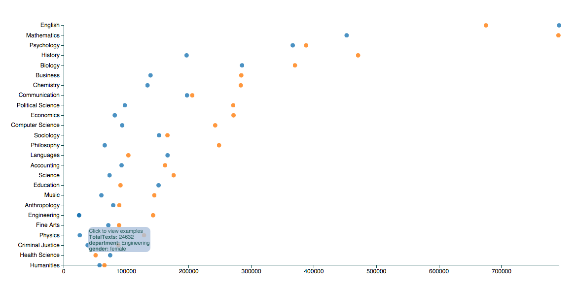
-1. (addition): The scores are normalized by gender and field. But some people have reasonably asked what the overall breakdown of the numbers is. Here’s a chart. The largest fields are about 750,000 reviews apiece for female English and male math professors. (Blue is female here and orange male–those are the defaults from alphabetical order, which I switched for the overall visualization). The smallest numbers on the chart, which you should trust the least, are about 25,000 reviews for female engineering and physics professors.
-
(addition): RateMyProfessor excludes certain words from reviews: including, as far as I can tell, “bitch,” “alcoholic,” “racist,” and “sexist.” (Plus all the four letter words you might expect.) Sometimes you’ll still find those words typing them into the chart. That’s because RMP’s filters seem not to be case-sensitive, so “Sexist” sails through, while “sexist” doesn’t appear once in the database. For anything particularly toxic, check the X axis to make sure it’s used at a reasonable level. For four letter words, students occasionally type asterisks, so you can get some larger numbers by typing, for example, “sh *” instead of “shit.”
-
I’ve been holding it for a while because I’ve been planning to write up a longer analysis for somewhere, and just haven’t got around to it. Hopefully I’ll do this soon: one of the reasons I put it up is to see what other people look for.
-
The reviews were scraped from ratemyprofessor.com slowly over a couple months this spring, in accordance with their robots.txt protocol. I’m not now redistributing any of the underlying text. So unfortunately I don’t feel comfortable sharing it with anyone else in raw form.
-
Gender was auto-assigned using Lincoln Mullen’s gender package. There are plenty of mistakes–probably one in sixty people are tagged with the wrong gender because they’re a man named “Ashley,” or something.
-
14 million is the number of reviews in the database, it probably overstates the actual number in this visualization. There are a lot of departments outside the top 20 I have here.
-
There are other ways of looking at the data other than this simple visualization: I’ve talked a little bit at conferences and elsewhere about, for example, using Dunning Log-Likelihood to pull out useful comparisons (for instance, here, of negative and positive words in history and comp. sci. reviews.) without needing to brainstorm terms.
-
Topic models on this dataset using vanilla sets are remarkably uninformative.
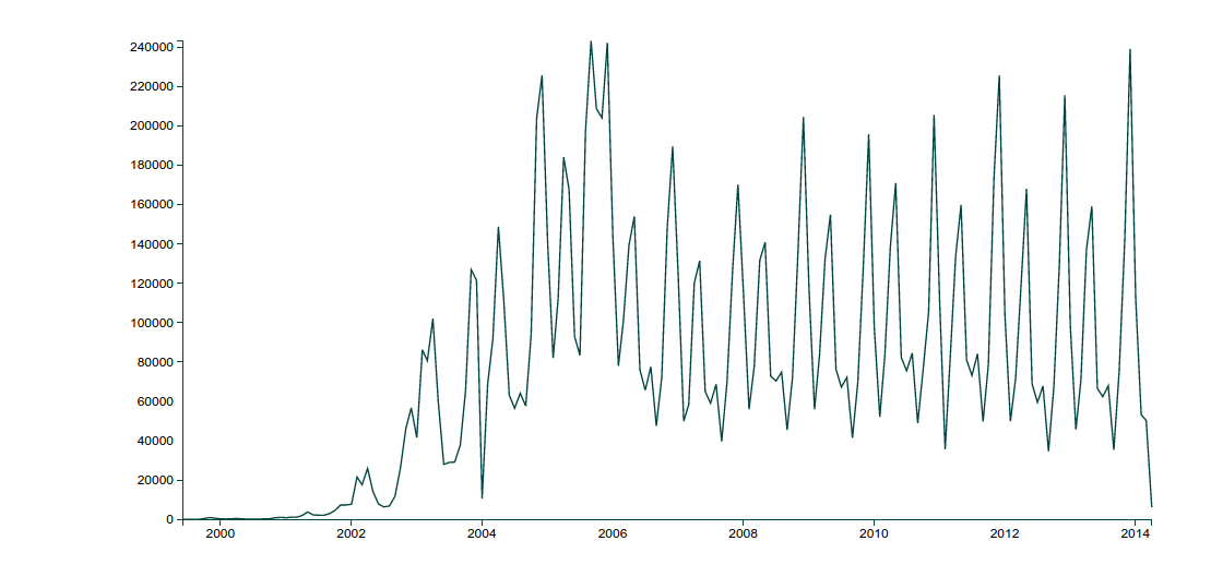
7.People still use RateMyProfessor, though usage has dropped since its peak in 2005. Here’s a chart of reviews by month. (It’s intensely periodic around the end of the semester.
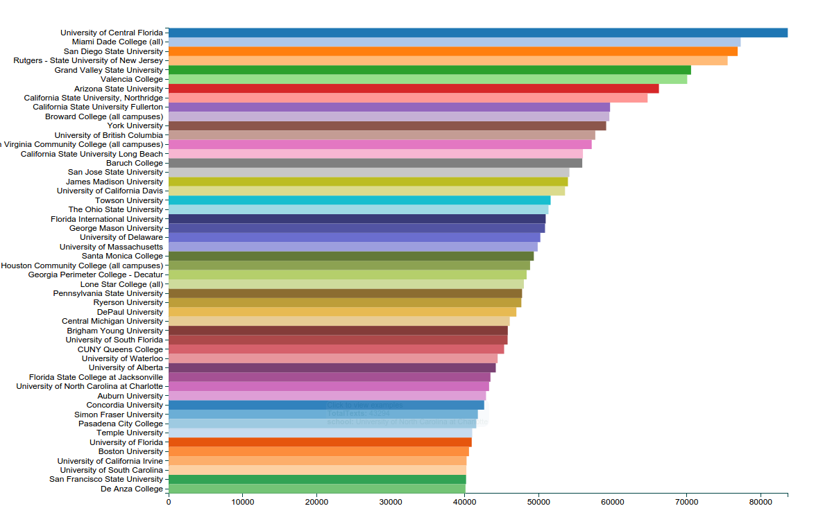
- This includes many different types of schools, but is particularly heavy on masters and community colleges in the most represented schools. Here’s a bar chart of the top 50 or so institutions: