The Wide World of Physics
I’ve been thinking more than usual lately about spatially representing the data in the various Bookworm browsers.
So in this post, I want to do two things:
First, give a quick overview of the geography of the ArXiv. This is interesting in itself–the ArXiv is the most comprehensive source of scientific papers for physics and mathematics, and plays a substantial role in some other fields. And it’s good for me going forward, as a way to build up some code that can be used on other collections.
Second, to put some code online. I’ve been doing most of my work lately–writing as well as coding–in RStudio using Yihui Xie’s fantastic Knitr package. The idea is to combine code with text to allow, simultaneously, literate programming and reproducible research. Blogger is pain: but all the source and text for this post is up at the Rpubs site, which is a very interesting project encouraging sharing research. You can go read this post there instead of here if you want code, but there are a few small changes. And the youtube clip is only available here.
The basic idea–to jump ahead a bit–is that it might be useful to create charts like the following, which show differing geographical patterns of usage. (Here, people talk about Harvard near Harvard, and Stanford near Stanford–but in Europe, Stanford seems to win out near the big particle physics projects in Italy and Switzerland.)
Click to enlarge
How we do that–and what we get from it–are both a little tricky.
Mapping the ArXiv
When Paul Ginzparg shared the ArXiv text-base with the Cultural Observatory, I was particularly excited about the ‘ e-mail submitter ’ field. Every e-mail address has a domain; it should be possible to trace that domain to a place in the real world in a structured way. At the first pass, we just put some basic information (top-level and institutional domain) as classifier features in the ArXiv Bookworm. Since ArXiv submitters are mostly scientists, that place is usually an educational institutions from around the world. (Or, increasingly, Mountain View, California: but fortunately, we’re not yet in a world where all e-mail is indistinguishable.)
The first step in this is geo-coding every web address that scientists have submitted from. This turns out to be somewhat trickier than I thought, but doable with a combination of internal whois calls and the great public API at freegeoip.net.
The first step is to use the Bookworm API to pull the e-mail domains. We previously parsed these down, to be either the last parts of the e-mail address (eg, ‘ uconn.edu ’) or, if the second part of the e-mail address is ‘ ernet, ’ ‘ ac, ’ or ‘ edu, ’ the last three parts. (This allows us to eg; ‘ jcu.edu.au ’; ‘ ox.ac.uk ’). There are about 6500 distinct e-mail addresses in the Arxiv.
The most common are the following: gmail.com, mpg.de, infn.it, cern.ch, harvard.edu, mit.edu, cam.ac.uk, caltech.edu, princeton.edu, berkeley.edu, stanford.edu, u-tokyo.ac.jp, jussieu.fr, kyoto-u.ac.jp, ernet.in.
Gmail is number one, and is mostly useless: but the rest should be good, traceable institutions. (Except for ernet.in, which is placing universities across India in Delhi; that will have to be fixed the next time around.) Using a function call to freegeoip.net (which is defined in the source code), it’s easy to get solid geographical data for any ArXiv submitter.
That returns results like the following, for “carleton.edu”:
        city region\_code region\_name metrocode zipcode longitude latitude country\_code            ip  country\_name     location
1 Northfield          MN   Minnesota       613   55057  -93.2007  44.4614           US 137.22.198.35 United States carleton.edu
While those results look impressively precise, they’re often for the home city, not the institution itelf: compare Carleton to St Olaf’s:
        city region\_code region\_name metrocode zipcode longitude latitude country\_code          ip  country\_name   location
1 Northfield          MN   Minnesota       613   55057  -93.2007  44.4614           US 130.71.96.8 United States stolaf.edu
When a city like Moscow or Beijing is used as a stand-in for the whole country, that can create issues. I’ll just note that and move on. In any case: the next step is to keep a list of the IP addresses on disk.
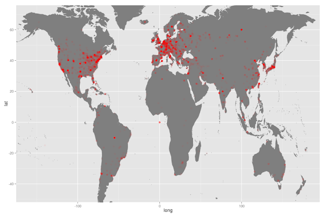
Once we’ve made that list, we can do a sanity check on the locations by putting them on a map.
This looks quite a bit like we’d expect a geography of science to looks: heaviest in the eastern seaboard and California in the Americas, in the old EEC in Europe, and in Japan and South Korea.
Of course, that’s just the locations of e-mail servers: there’s no sense of which universities put out the most research. We can correct that with a quick API call to Bookworm, and get some maps that show the density of words produced in each of the sets. As points, that looks like this–pretty much the same as the raw location data, but with slightly better defined clusters in Europe and on the American east coast.
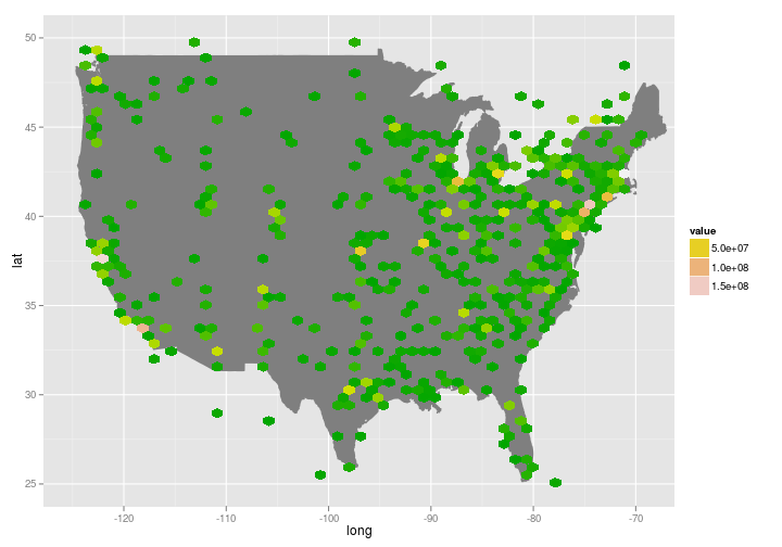
To do density, it makes sense to try to bin these together somehow. One possibility is to throw down some hexagonal bins and shade them from green to white: that does a decent job at showing high concentrations in New York, Washington, Tokyo, London, etc.
That’s somewhat clear, but it’s also too reminiscent of the Nintendo era and the highest peaks (Boston and Mountain view here) don’t stand out.
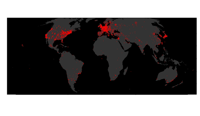
A more contemporary visual vernacular uses a grey-on-black palette and some transparency to get at the same data.
I tend to think that this color scheme is heavily overused nowadays; for most cases, I like white backgrounds much more. But it has one big advantage: it lets you use a three-color transition from red-to-white-to-blue to indicate intensity. (Using red-to-black-to-blue on a white background doesn’t work nearly as well). That’s going to be important to me in a little bit–so I’m going with the Zeitgeist on this one.
So: where is science published?
(Click to enlarge any of these charts.)
They show, among other things, a very strong clustering of scientific research in a few parts of the first world. I was expecting mostly the US and Europe: but I’m surprised, visually, at just how empty places like South America and Australia seem by comparison. The United States is somewhat distributed geographically (although California and the Bos-Wash corridor really outdo themselves: the core EU countries and Britain are overwhelming as well, as is Japan. There are occasional flickers in the Southern hemisphere.
Science in Motion
How did it get to be that way? Is it changing? We can start to answer this by pulling in other metadata in our database. Should we want to look at history of how these counts change over time, for example, it’s easy to build a movie from each successive month. That nicely illustrates, among other things, China’s entrance into the world physics community over the last 20 years.
(Watch in HD for best results: sorry about the thumbnail).
Plotting Words Geographically
Where this really gets exciting, though, is that this sort of thing can tell us about usage patterns, not just overall usage.
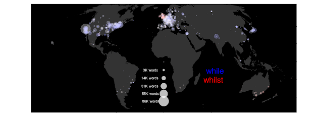
I wrote a function, for example, that shows how heavily one word is used in each of these geographic bins compared to some other word. The basic idea is pretty much the same as the Bookworm plots, but across geography instead of time. It makes the most sense, I think, to scale these results: here blue means little usage, white the average amount of usage, and red high usage.
This can show absolute levels, but those are frequently not very clear: as for instance here, where a number of the large centers (Stanford, CERN, etc) shade towards talking about the Higgs more than many smaller universities scattered around the world.
It really shines at binary comparisons, though. We can see anglophone and Americaophone usage of “while” and “whilst”, the geographical peripheries of universities and cities, and other similar features. Note that the sizes here correspond to the total usage of _both_ of the words shown: so “Yale” is big because it uses “Yale” a lot and “Oxford” a little, and “Oxford” big because it uses “Oxford” a lot and “Yale” a little. I think this makes more sense than scaling by the total number of words in the corpus.
This is a methods post, not a results one. But just to speculate a bit:
The ‘ while/whilst ’ result is suggestive, in that it indicates we can track cultural phenomena completely independent of science in the data. (India looks more like America, while Australia and South Africa look more like Britain: that’s interesting to me.)
The university and city stuff can be interesting as well if we look in the right places. Obviously no one cares that “Harvard” is used more than “Stanford” in Cambridge; but the higher results for Stanford near CERN, and for Harvard–to stretch–in Australia may be telling us interesting things about the way that a project like the SLAC can get international recognition.
But the real applications should be slightly more interesting than this.
Let’s leave it at that, for now.


