In the digital humanities and in the rest of my work, I explore the tension between data and quantification, on the one hand, and human experience and humanistic tradition on the other. My work on the history of quantification draws heavily on my ability to re-interrogate historical data as a source in itself. My work that tends more towards data visualization and information retrieval draws heavily on humanistic methods and goals. A portfolio is below.
Creating Data: online traces
My current major archivally grounded research project, “Creating Data,” charts the origins of modern computational culture in three key institutions of the late 19th century American state: the US Naval Observatory, the Census Bureau, and the Library of Congress. Since it uses the data created by the institutions themselves to better understand them, this project is inherently digital: some of the work has so far only been presented as conference papers and invited talks, but other elements are online.
The kernel of my major project can be seen in a seven-part serial study on visualizing the locations of the American whaling fleet. The best point of entry is the overview page; the central post in the series is here. This built off of methods from the single most widely circulated post on the blog, which used ship’s logs originally digitized for climate research to show the paths of European ships in the 18th and 19th centuries.
The first component of my project on data and the state has also found both a scholarly and public audience. My data visualizations of oceanic shipping have been seen and discussed hundreds of thousands of times, and I continue to work with institutions like NOAA’s Science on a Sphere Program and the New Bedford Whaling Museum to bring these maps to a wider project. But maps like these serve a double purpose. First, they can promote reflections by historians or the general public on the actual facts of shipping and its place in society.
Visualizing ship paths from the US Maury Collection (ICOADS deck 701)
But they also admit of deep historical readings as artifacts of state creation themselves. The skeleton of an argument I have since fleshed out in a number of talks is at this blog post: it shows that far from naively reflecting shipping paths, the ICOADS collection is a patchwork library (just like, as I have argued, Google Books or Hathi Trust itself) that bears the the story of its own creation.
Visualizing state data-collecting strategies from the ICOADS set over the last 100 years. Clockwise from upper left: destruction of data by region (German weather service, 1876-1914), distortion due to low punch card resolution (US Navy, 1941–45), gridding from Soviet state planning of routes (bulk 1950-1989), and swirling patterns from unmanned drifting buoys (West German drifters, 1980-1996)
Whether reading books or maps like these, I argue that we need new methods for reading digital sources. By treating historical data and historical data visualizations as artifacts that demand expert, nuanced study in their own right, I return principles of source criticism, hermeneutics, and close reading to massive data sets. The rhetoric of “Big Data” occludes the fact that the actual artifacts we study–visualizations, maps, re-arranged texts–are still always perceived on the human scale. In bringing creative approaches and knowledge of the subject matter to these digital archives, I tell useful stories. The ultimate publication of these sources will include not just these static visualizations, but a new one I have designed (unreleased and still somewhat rough around the edges, but with working interactions) that both allows deep interaction with the individual ships by showing their identity, and creates a framework through which I (or anyone else–for example, a museum highlighting a particular ship) can build guided narrative tours through a database of hundreds of thousands of voyages.
This research has already led to some more traditional publications: for example, my unorthodox use of topic modeling algorithms on geographical points grounded an article for the Journal of Digital Humanities on the uses and abuses of topic modeling (LDA) in the Digital Humanities.
My more recent work, on the census, is less readily available online, but lends itself yet more easily to publication through traditional journals with widely engaging digital supplements.
Bookworm
My work in giving shape to massive digital collections is most fully expressed in Bookworm, a long-term collaborative project I co-direct with Erez Aiden at Rice University. Bookworm offers a platform for making compelling visualizations of textual data, extracting data for research, and interacting directly with the texts in massive digital libraries. Tools for natural language processing often presume the user is working with unstructured text. In most humanities cases, though, the metadata of a text is extensive and as useful for interpretation as the text itself. Bookworm makes it easy to take advantage of whatever metadata a large text library has. Anyone can use it situate the language of books in time, newspapers in space, and journal articles across disciplines.
Bookworm fills a need for libraries, archives, and scholars who want to allow richer access to their collections than a simple search engine. Established digital humanities tools like Omeka allow museums to present their archives online using a set of customizable but manageable libraries. Bookworm does the same for raw texts, allowing a variety of quantative analyses and data visualizations. A few instances not made by me or the core Bookworm team include the Vogue magazine browser at Yale and the Sandbox Hathi Trust browser, which we are currently improving under an NEH grant.
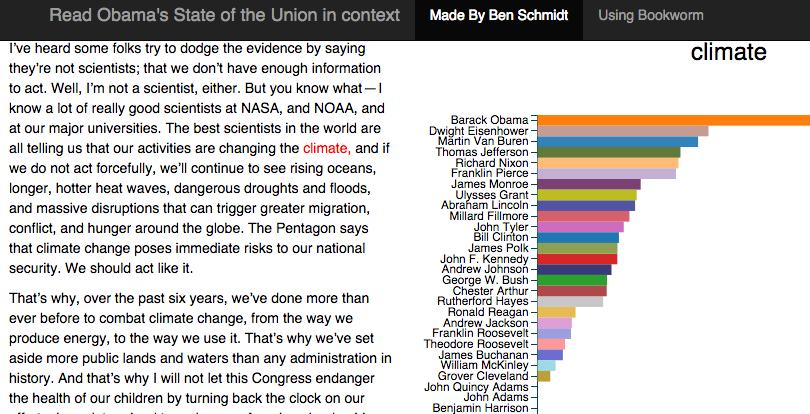
The underlying API and visualization libraries I have designed make Bookworm far more flexible than just line charts over time. I have recently several of these showcased these in a variety of Bookworm applications around the history of the State of the Union address. Using tools from the Stanford Natural Language Toolkit, geocoding, and custom extensions to Bookworm, Mitch Fraas of the University of Pennsylvania and I produced an interactive animated map of every place mentioned in the State of the Union, assembled a team of foreign policy historians to interpret it for a wider public, and published it as a feature in the Atlantic. A second Atlantic feature showcased the usage of individual words by president. More experimentally, I posed on my own website and example showing dynamically generated in-browser corpus comparison: users can compare any two presidents to see as the code is brought to other corpora, it will allow a more lightweight version of dynamic corpus comparison on offsite collections, one of the most exciting features of projects late-2000s digital humanities projects like DiRT and MONK.
In all of these forms, though, the software supports the core goal of bringing the reader to the original text. This is perhaps most clear in a template I published for the State of the Union that allows you to read any state of the Union in the context of any other. Most search engines focus on helping you locate the needle in the haystack: while my work makes that easier through rich metadata, it also lets researchers to better understand the archive as a whole through the context of the individual text. After clicking on climate, the user can read _any _past usage of the term. Tools like these are useful for scholarship and invaluable for public history and for pedagogy; I am frequently told by both college and K-12 teachers that they incorporate this or another visualization into their lesson plan.
I’ve drawn inspiration from the strong emphasis on public history shared by digital history departments in finding a wide audience for even my computational work. My work on algorithmic detection of anachronisms in popular movies has reached audiences through two articles (about “Mad Men” and Lincoln) in the Atlantic, through television and radio appearances, and through consulting work on period dramas like Showtime’s “Masters of Sex.” But at the same time, the algorithm can be used for literary criticism (I have presented on it, Edith Wharton, and Walter Scott), and I am currently developing a grant with a scholar in the UK that will use the underlying technology to better identify transcription errors in scholarly editions.
Higher Education Policy and the Historical Profession
I also engage deeply in the creative work of programming for the Internet to promote openness about the decisions we make about data. My writings for the New York Times and Chronicle of Higher Education in 2013 helped shape a national conversation away from a fallacious notion that the humanities were in “crisis.” Drawing on decades of government reports, I made interactive charts that carried readers through one of a number of preset narratives or allowed them to explore the data on their own. A brief experimental piece on the years covered by history dissertations has been a crucial point of evidence in a forthcoming debate over the book, *The History Manifesto, _in the _American Historical Review.*
I maintain an active interest in providing perspective for academics and the general public on issues related to higher education policy. Currently, I am using Bookworm for a study of 14 million reviews from RateMyProfessor.com. The platform lets me tag faculty by gender to reveal the implicit biases in student reviews. In every field, for example, students are up to twice as likely to describe their male professors as “brilliant” as their female ones, one of several insights I will explore in a subsequent article.
Other Research
I use my blog to create contribute to conversations among scholars and the wider public. Posts are frequently assigned in Digital Humanities courses across the country and are regularly featured on Digital Humanities Now. Two have led to publications in the Journal of Digital Humanities, one on the place of critical theory in the Digital Humanities and the other, previously mentioned, on the uses and abuses of topic modeling (LDA) in the Digital Humanities. Some of the most representative recent posts include the two-part set on plot arcs in popular television.
But finally, online work can be sophisticated and fun at once, and I try to take advantage of the affordances of the medium. My work on anachronisms probably provides the best example of this, but if you visit my gallery of data visualizations, you will see several more such as my use of GIS to show the distortions of space wrought by public transit maps.