Here’s a very technical, but kind of fun, problem: what’s the optimal order for a list of geographical elements, like the states of the USA?
If you’re just here from the future, and don’t care about the details, here’s my favorite answer right now:
["HI","AK","WA","OR","CA","AZ","NM","CO","WY","UT","NV","ID","MT","ND","SD","NE","KS","IA","MN","MO","OH","MI","IN","IL","WI","OK","AR","TX","LA","MS","AL","TN","KY","GA","FL","SC","WV","NC","VA","MD","DE","PA","NJ","NY","CT","RI","MA","NH","VT","ME"]
But why would you want an ordering at all? Here’s an example. In the baby name bookworm, if you search for a name, you can see the interaction of states and years. Let’s choose “Kevin,” because it played such a role in my anachronism-hunting piece on Lincoln.
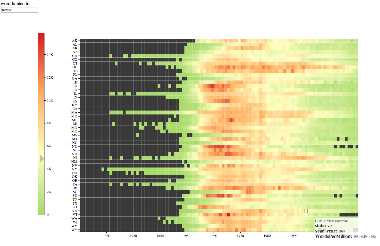
Clearly the name took off around the start of the baby boom. But is there a geographical pattern? It’s very hard to say. It does look like the red names begin around 1955 in much of the country. But in a few, it’s not until the early 1970s. Which ones? Alabama, Georgia, North Carolina, South Carolina. That is, after substantial reading parsing over to the axis, it’s clear that most of those are southern states. But this is the sort of insight that should be immediately obvious. And there may be other connections we’re missing out on. The whole point of data visualization over tables is that you can pick out patterns using faster forms of cognition: requiring you to push over to the left to read off the names is a major loss.
Alphabetical order makes it easy to find any individual state (assuming you know its name) but hard to see the way related states move with each other. It means that to trace out regional variations over time, we tend to animate maps: but using time as the proxy for time makes cross-temporal comparisons much harder to tell. As Tufte says, comparisons should be enforced across the eyespan: relying on animation to trace out common names is a big problem. So there’s a dramatic interest in seeing different names pop up in (for instance) Reuben Fischer-Baum’s animation of baby names; but you have to watch the whole thing to think through questions like “what regions tend to adopt names early?” or “what’s the name that stays on top for the longest?”
Putting it all into X-Y makes these questions easier. But that means we need to map states to X or to Y. Alphabetical order means that states are not arranged in a way that places states near others like them.
So how could we make the states usefully arranged? We need some dimensionality reduction.
Linear reductions
One obvious way would be east-to-west or north-to-south: that starts out quite well, with all of New England:
ME MA RI NH VT CT NY NJ PA DE MD DC VA NC SC WV OH FL GA MI KY IN AL TN IL WI MS MO LA AR MN IA TX KS NE OK SD ND WY CO NM MT UT AZ ID NV CA OR WA AK HI
But quickly falls apart with Ohio, Florida, Georgia, and Michigan in immediate succession. If we plot the states, you can quickly see why. Rather than list orders, I’m going to show them as paths through a map: here’s what that looks like in this case.
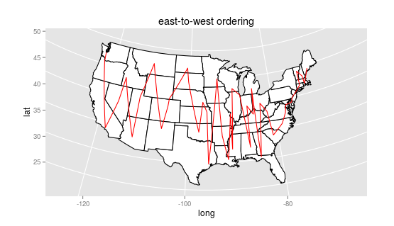
(By the way, you can see that the points are a little arbitrary: I’ve taken the first geonames hit for the state, which is sometimes the capital, sometimes the state centroid, and sometimes the most important city. Ideally I’d be using the population-weighted centroid, but in some ways I kind of like the results that come out of this.
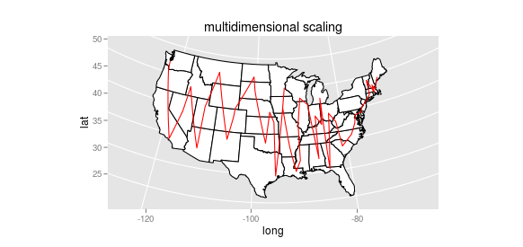
There are some other possibilities for linear dimensionality reduction (principal components comes to mind) but they’ll have the same fundamental problem. We want a metric that takes proximity more fully into account. Even non-metric multi-dimensional scaling fails: it handles a couple cases better (Jackson and St. Louis are in a more sensible order, for instance), but it still jumps erratically up and down, preventing any larger groups like “the south” from coming into sight:
Hierarchical clustering approaches
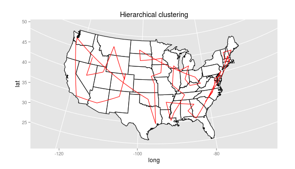
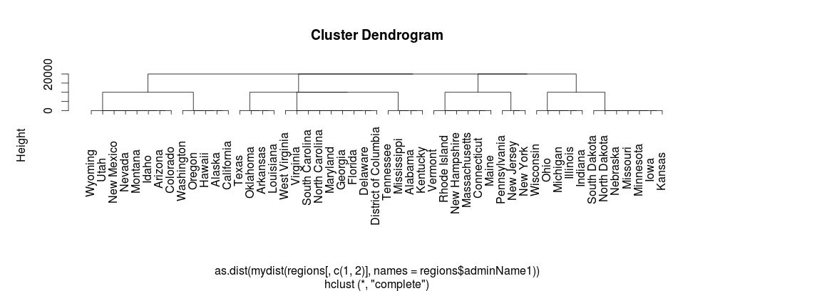
One possible approach, suggested to me by Miriam Huntley, is hierarchical clustering: using distances, we can cluster the states by proximity. Here’s the initial result of that:
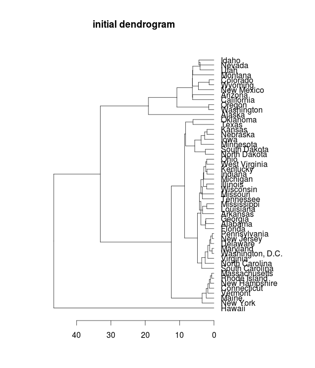
The individual groups are quite nice (New England is there, plus New York at the end), and every state is adjacent to an immediate neighbor. And while the groups have geographical coherence, they aren’t exactly the regions we know and love: the “mid-atlantic” runs down to South Carolina, and the midwest includes the gulf coast all the way to Tallahassee. The connections between the groups are scattered. Florida is next to Pennsylvania, and South Carolina to Massachusetts. Seen as a path, the weirdness of this is clear:
Leaf ordering in dendrograms is arbitrary, however, and we can do better than this. Using a method developed by Bar-Joseph et al, and implemented in the “cba” library for R, we can reorder the dendrogram so that groups stay the same, but the leaves are ordered so that transitions from one group to the next are maintained.
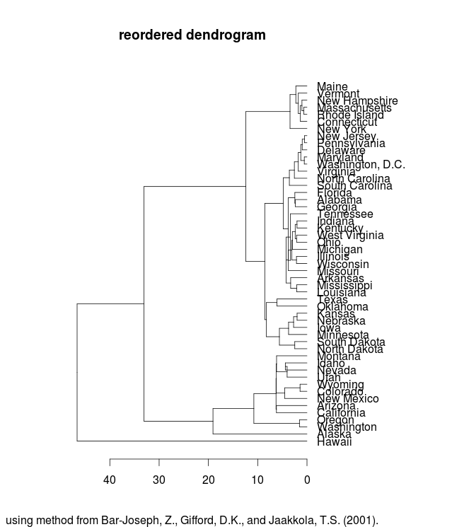
Now, the path looks considerably better:
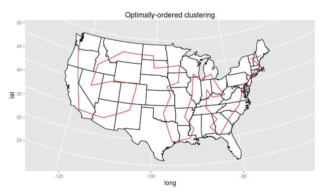
The clusters remain adjacent, but now the transitions are so smooth that it’s not obvious where one begins and the other ends. Instead, we get a serpentine path through the states that both ensures every path is between two adjacent states, and keeps paths generally inside the same region.
Network approaches
Can we do better? The strategy of plotting these as paths suggests that maybe this is an instance of the traveling salesperson problem, in which we want to travel through all the states minimizing the distance traveled. Why shouldn’t the “best” solution simply be the one where the overall sum of distances is the least?
Inserting a dummy node as start- and end-point lets us view that: using the best method found by the “TSP” package in R (which is not guaranteed to be the optimal solution, since the traveling salesman is a notoriously difficult problem to solve), we get quite a different path:
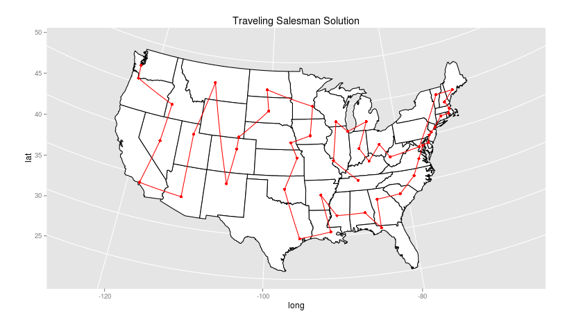
Rather than start in Maine, this route begins in Tennessee! After winding through the Midwest to West Virginia, it leaps to Vermont and then takes a beautifully practical course down the Eastern seaboard through Texas, through the great plains, and then takes up nearly an east-to-west ordering through the Mountain and Western time zones. While many of the regional choices here look better to me than the dendrogram solution (particularly the coherence of the south, the distance-optimizing strategy means that there are a few nearby states that have nothing in common: the leap from New Mexico to Montana, for example, and the extremely strange choice to place Washington DC between West Virginia and Vermont, ten nodes removed from either Maryland or Virginia, the closest geographical points. (In fact, I think the route could be improved by heading straight to Vermont from WV and putting DC in its rightful place: but it says something that out of the 7 algorithms in the free version of the TSP package, none was able to improve on this route).
Fractal Curves
Another option is not to minimize travel distance but to maximize the likelihood that two points will be next to each other. That suggests filling the geographic region with some kind of fractal curve, and then positioning each state along the curve.
This is an appealing way to think of arranging the country linearly: not as a network,
but as iterable set of points. For just the United States, we could use some
already-existing curve path. The most widespread linear mapping of points is the Zip
code system: Samuel Arbesman has
written about this on Wired, and includes a link to
Robert Kosara’s ZipScribble maps. Here’s Kosara’s idea with a few minor changes (I use a rainbow spectrum,
rather than coloring each state separately, and an Albers projection. And it appears
that the zip database I have handy has something weird going on in southwest
Georgia.) 
Space-filling curves
The ZIP system isn’t especially logical, but there should be something similar that’s better. My first thought for this problem, which the whole post, was to use a Hilbert Curve. It turns out that Kosara has mapped that approach onto the Zip dataset.
Using just the state points, it’s possible to draw a Hilbert curve that covers the continental United States, and then visit each state at the moment it’s closest to the curve. The actual path taken can then be simplified down to eliminate the intervening states. Here’s what that looks like, with both the Hilbert curve and the simplified route. I’ve shaded the Hilbert curve using a double rainbow so it’s easier to trace from its origin near the Bahamas (first making shore near South Carolina) to its exit off the coast of Los Angeles.
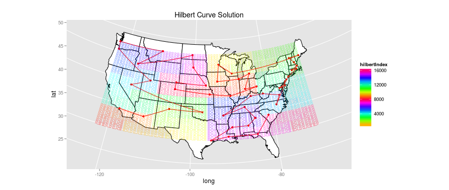
I’m disappointed by the performance here. While there is some regional coherence (the stretch from Wisconsin to Kansas is well done, and the first jumps through the South are acceptable), the square binning forces some rather strange choices: the odd jag down to North Carolina, the detour to Colorado and Wyoming.
There are other issues as well. Hilbert curves work best in square spaces, and the
patches of ocean/Canada/Mexico that get filled are pretty far off limits. While I
don’t show Alaska and Hawaii, for the other algorithms they’ve simply been
tacked on at the end in a reasonable manner: here, though, a solution that includes
Alaska and Hawaii makes some significant changes to the full arrangement and vastly
increases the percentage of empty space, which tends to introduce odd decisions (like
interposing Alaska between Oregon and Nevada.)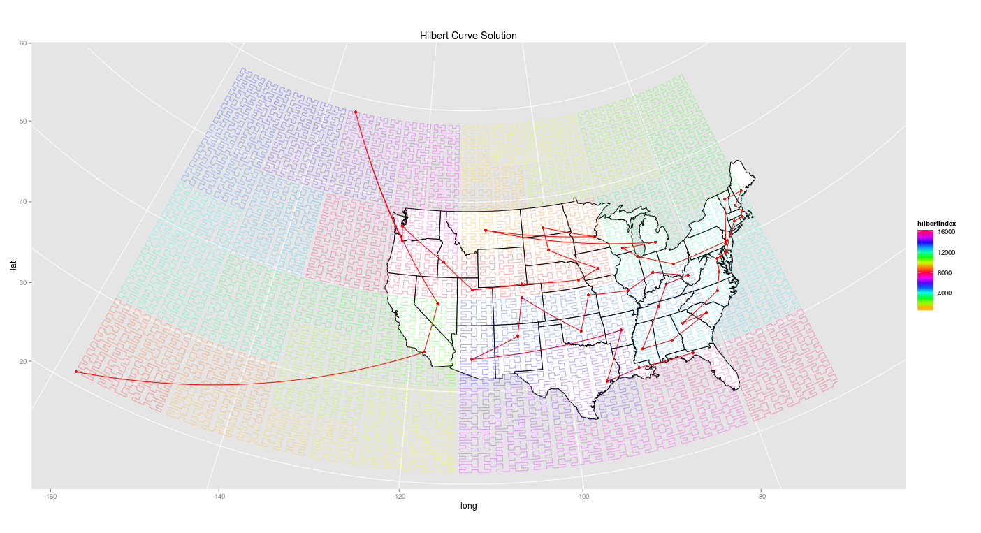
I suspect there are ways of optimizing the Hilbert curve, or some similar fractal path, so that it better maps onto actual geographic spaces. That seems like an interesting avenue, potentially: but the initial results here seem worse, not better, than traveling salesman approximations.
Conclusions and Deus ex Machina
So on this particular set, the best results seem to come from, in descending order,
1) Reordered hierarchical clustering
2) Traveling Salesperson solutions
3) Fractal Curves
4) Quasi-linear dimensionality reduction (east-to-west, multi-dimensional scaling, etc).
For the general problem (European countries, say, or counties in a state) I’d probably start with reordered hierarchical clustering or TSP solutions, at least until I learn how better to fit a fractal curve to an arbitary space.
But for this particular problem, I’ve got an ace in the hole: there _are _conventional orderings of states that provide an acid test. In particular, we want something that matches to census regions.
The ordering inside census regions is arbitrary, just like our clustering diagrams. So the best possible solution that includes some knowledge about the intrinsically _real _regions of the United States (the midwest, the south, etc.) is to combine the census regions with the optimal-dendrogram measures.
Putting phony clusters just from the census regions looks like this:
I can just plug those into a dummy distance matrix so that group membership trumps any other sorts of distance: and then allow geographical distance to sort out the spinning of those trees into a more sensible order.
So, adding the constraint that census divisions and regions be kept intact, the optimal ordering looks like this: starting in Maine, traveling through the South west to Texas, skipping to the upper Midwest and then taking the same route west through the plains and mountains as the dendrogram:
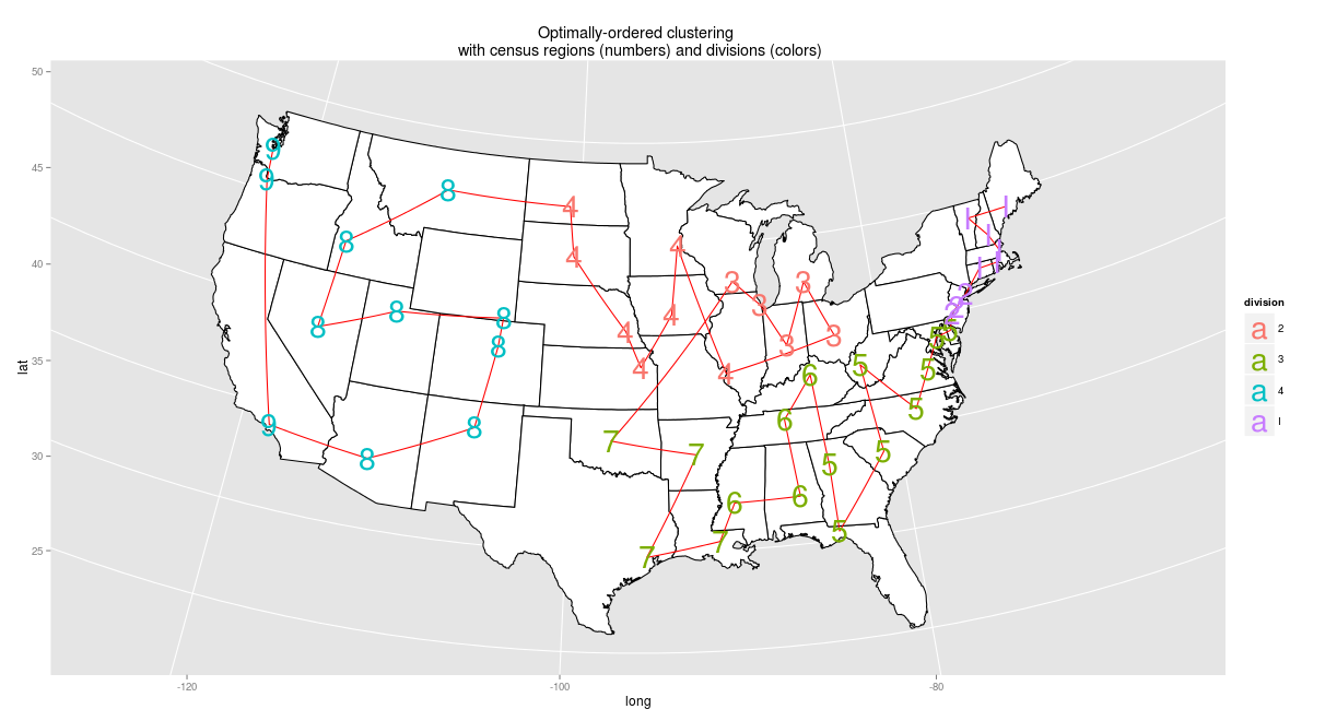
Is this the perfect ordering? To my mind, it’s not: but the flaws come straight from the census, not from the algorithm. West Virginia should not in the coastal south, it should be in the same division as Kentucky; the leap from Oklahoma to Wisconsin is unfortunate, and so is the one from Florida to Kentucky. Still, the census regions constrain is quite nice to have. And unlike the unguided paths, it preserves all but one of what I intuitively think of as the essential pairings: the Dakotas, the Carolinas, Alabama-Mississippi, Vermont-New Hampshire, Kansas-Nebraska, Colorado-Wyoming.
So, let’s return to the original visualization to see what this new ordering helps us see. Remember, this original version revealed only with some serious axis-reading that the South starting using “Kevin” later.
Here it is with the census-based ordering. (For a version you can hover over, see the browser itself). The southern states, two-thirds of the way down the page, clearly do begin later: but now it’s also immediately evident which of them _don’t _lag as much. There are also several patterns that are immediate evident which remain completely obscure in an alphabetical ordering: usage of “Kevin” is significantly higher around 1990 in the northeast, particularly the mid-Atlantic, than it is in the rest of country. And while the South waits the longest, a lag in the Arizona-New Mexico pairing is also clear.

This style of display also makes subtler patterns visible. “Jennifer,” for example, rises a year later in the South than elsewhere. That would be lost as visual noise in an alphabetical ordering, but is completely clear here.
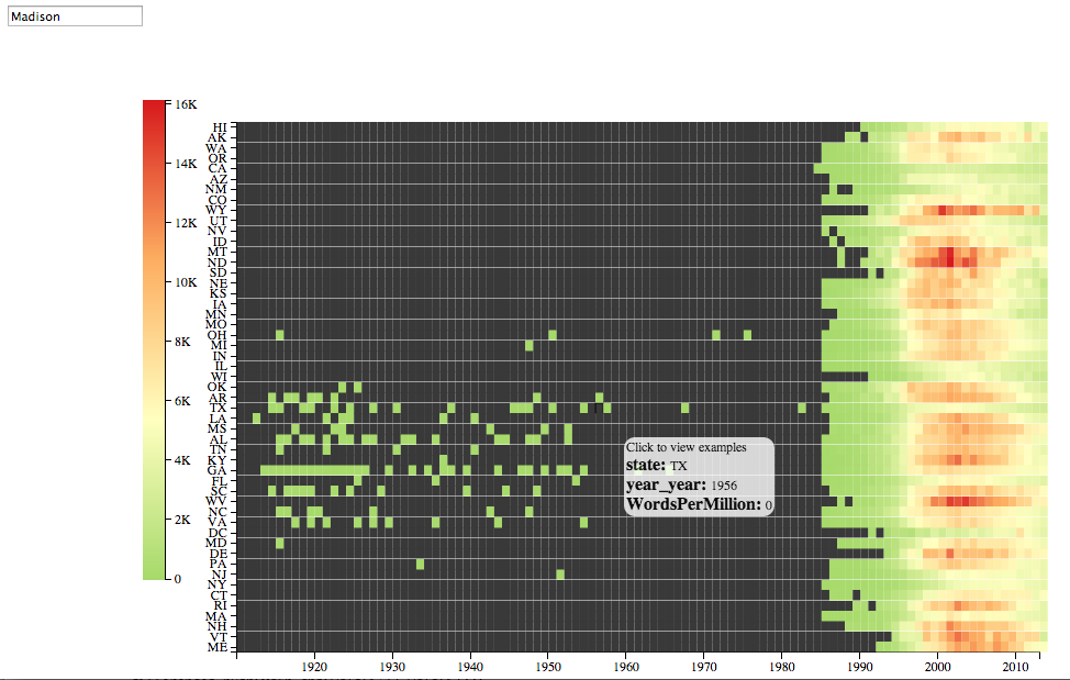
Is a geographical ordering the best? Not always. Take “Madison“: its rise shows striped bands that don’t seem to be regional. Illinois, New Jersey, Washington DC, and New Mexico all avoid the wave. In fact, if you look closer, this is clearly a racial thing: “Madison” was most popular in states with overwhelmingly white populations. (Except Wisconsin, it seems). And aside from the bend through the southwest, there aren’t a whole lot of largely-minority states in any contiguous curve.
But on another level, that just points out more the usefulness of _some _sensible ordering to start with.